Greenbank Farms
Unused rebranding for Greenbank Farms. A refreshed logo and packaging were commissioned by a small marketing firm, but the project was unfortunately cancelled by their client.
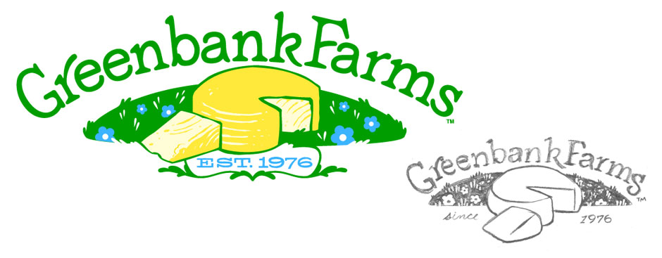
The brief called for an updated logo to replace the original that had been in use for almost 30 years. The logo varied across cheese labels and the designs were inconsistent throughout. Sales have been slumping and the marketing team planned a revitalization of the brand to pull in new customers (and stores) and give the "everyday" cheese an upscale look.
The new logo reflected the heritage of the brand's history, condensing the complex illustration into an iconic image of a cheese wheel laying in a fresh green pasture. The typeface was handlettered & customized from a soft, rounded font to give it a homey feel.
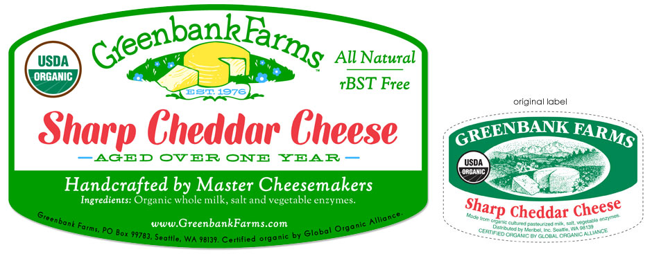
A customized font for the cheese labels was also created for the cheese type displayed. A system of label templates was devised for the different cheeses the brand offered.