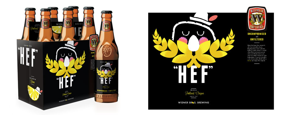
Widmer Beer
Comps for theoretical packaging redesign of Widmer Brothers' signature beer. The brief called for a hip, funky feel while recalling their heritage.
NOTES:
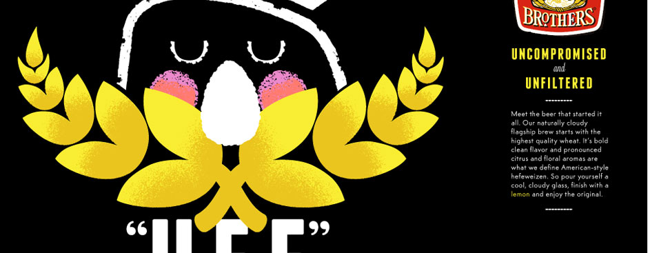
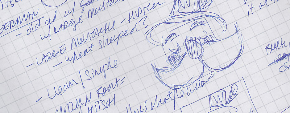
• "altbier"- return to roots (alternative beer in the 1980s)
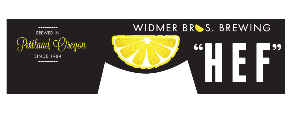
• lemon is a traditional addition to the hefewiesen
• wheat moustache
• "hef"- noone asks for "hefewiesen" at the bar
• high contrast w/black
• clean/simple
• modern w/a touch of kitsch
• yellows - denotes color of wheat and lemons